Hashnode is an amazing platform for getting your blog up and running as a software developer in seconds. The fact that you've got so many amazing features that you could only dream of if you were creating your own blog from scratch, simply amazes me! From the dashboard to the reactions to the amazing community. But just like a software developer opens Inspect Element on a random website to see the HTML behind it, as someone with a blog on accessibility, it was my instinct to do my own little "checks" on websites: is it accessible with a keyboard? Do images have good alt text?
With these little "checks", I've found a few things that could be addressed to make your blog and mine, more accessible. Here they are:
1. Contrast
One of the things that stood out to me on Hashnode blogs is the contrast between the text and background of some elements of the blog.
For example, the focus between the menu items and the background.
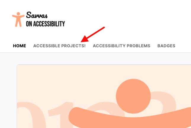
The WebAIM Contrast Checker, shows the navigation text and background fail the contrast check for normal text (as opposed to large text), which is what the navigation links are.
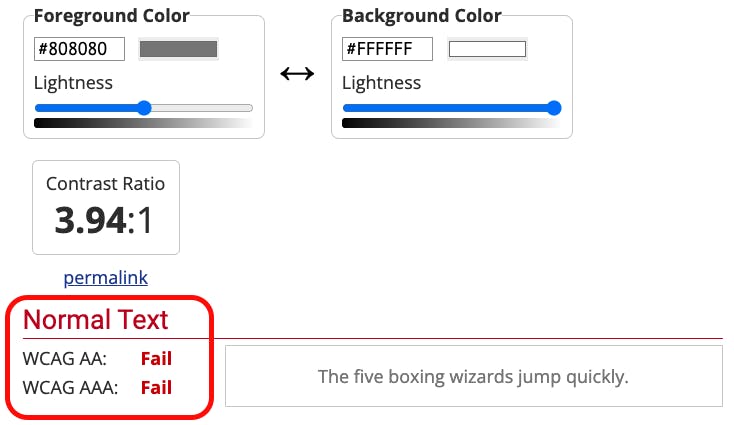
Similarly, in dark mode, the navigation text and background also have contrast issues, but only for the stricter "AAA" standard.
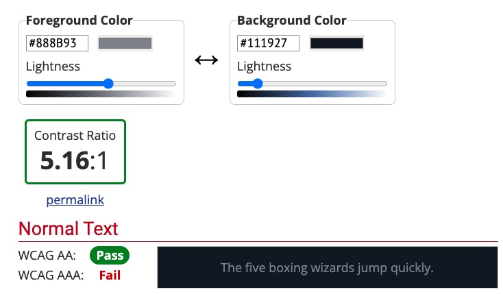
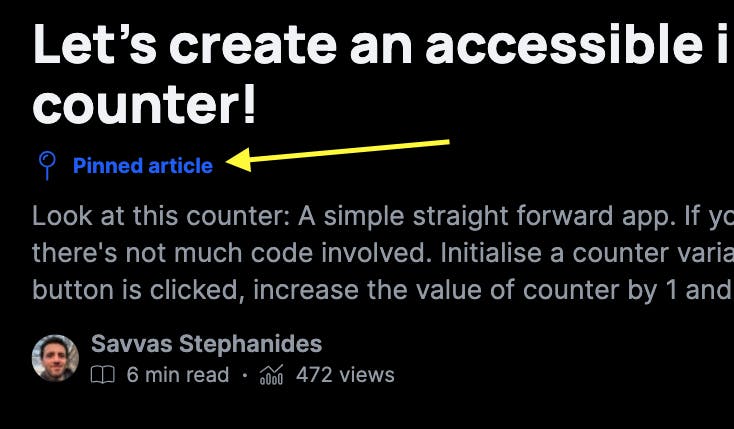
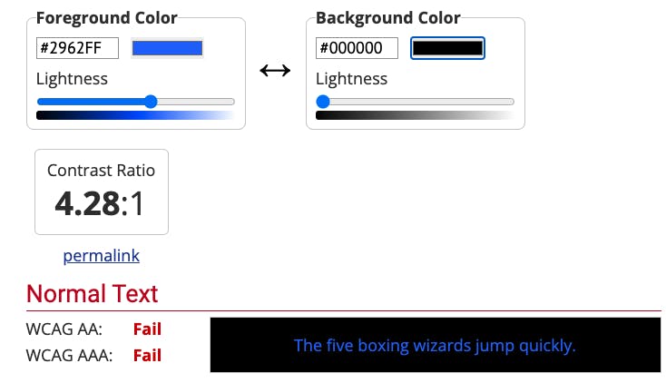
Another feature with contrast issues, is the "Pinned article" flag.
which fails both AA and AAA standards for normal text.
2. Keyboard focus
One of the more obvious issues with Hashnode's blogs come when trying to access the blog with a keyboard. Specifically, how focus on an element is shown within the website.
Header focus indicators
For example, notice how focus is shown while navigating the header with the Tab key:
The blog logo shows the outline correctly when it has keyboard focus.
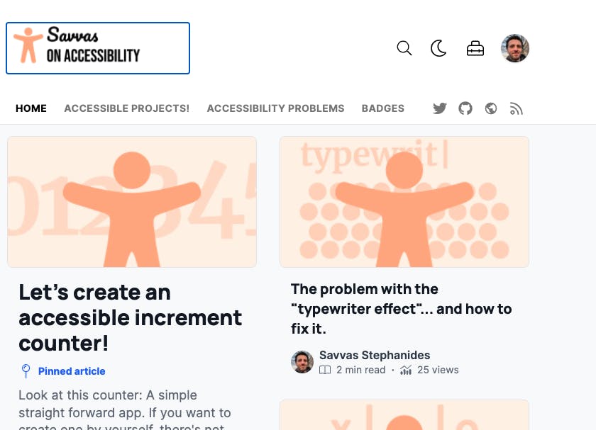
The magnifying glass doesn't have an outline when it has keyboard focus.
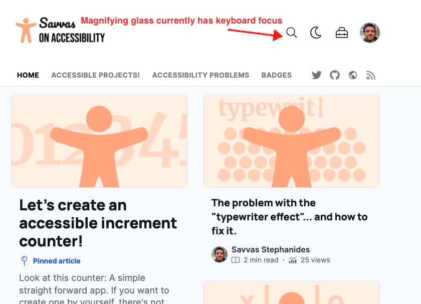
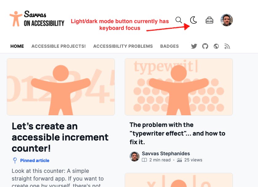
The light/dark mode button doesn't show that it has keyboard focus.
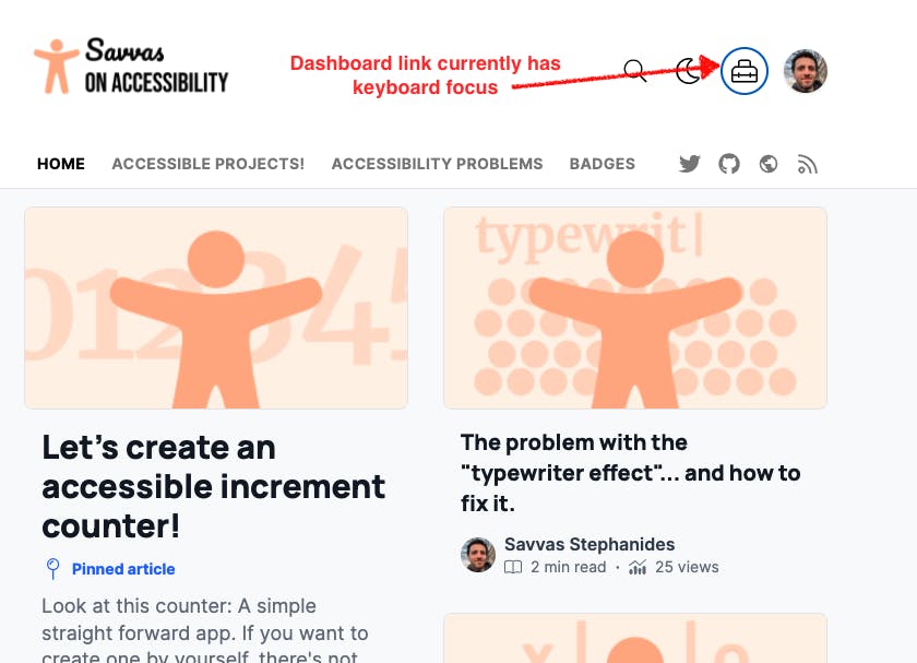
The Dashboard link clearly shows it has focus.
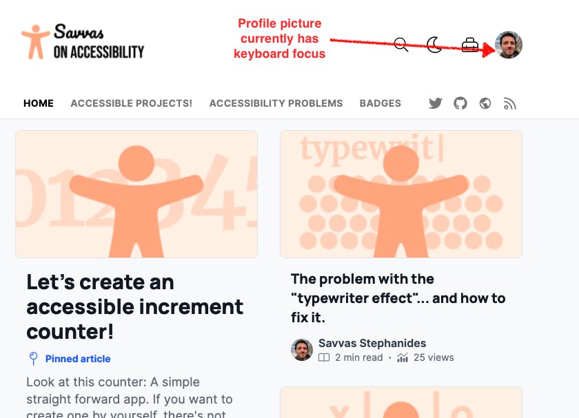
The profile picture has focus but it has no outline that shows that it does.
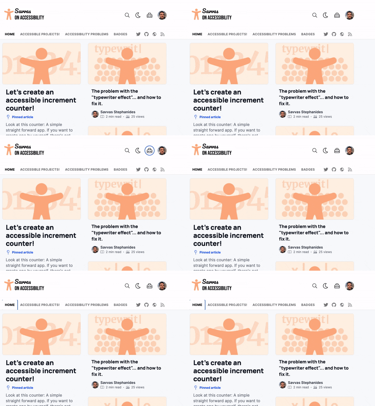
This is how the whole experience looks like:
A quick inspection shows the part of CSS where it all happens:
.css-wme9tu:focus {
    outline: 2px solid transparent;
    outline-offset: 2px;
}
Extra focus on invisible items
Another issue with the header is when trying to tab through the navigation bar (Home, Badges etc). After we tab through all the navigation elements and before the social media icons it seems there are 2 more invisible elements in between because it takes 2 extra Tab clicks after navigation, before reaching the first social media icon.
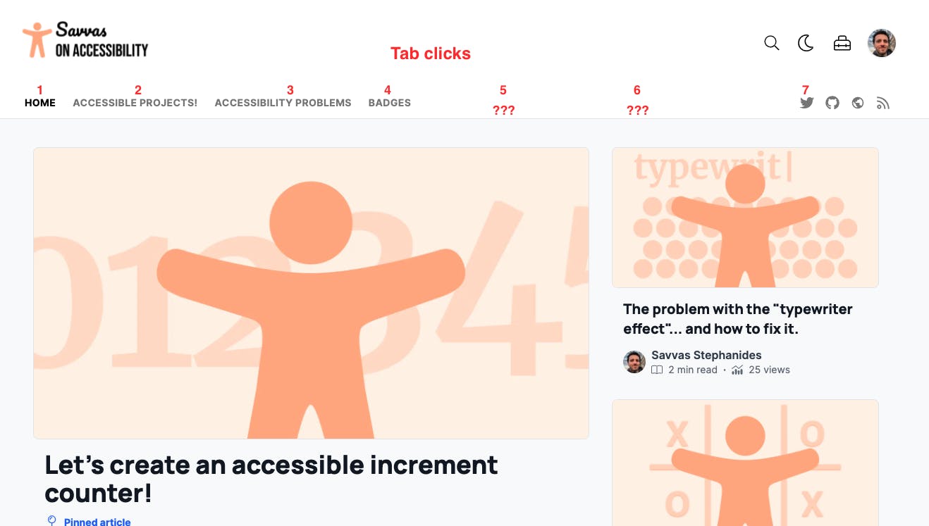
From a quick inspection it seems that there are 2 extra divs that have tabindex="0":
<div class="ps__thumb-y" tabindex="0" style="top: 0px; height: 0px;"></div>
Redundant links
In the blogs' homepage, there seem to be 3 links pointing to the same page.
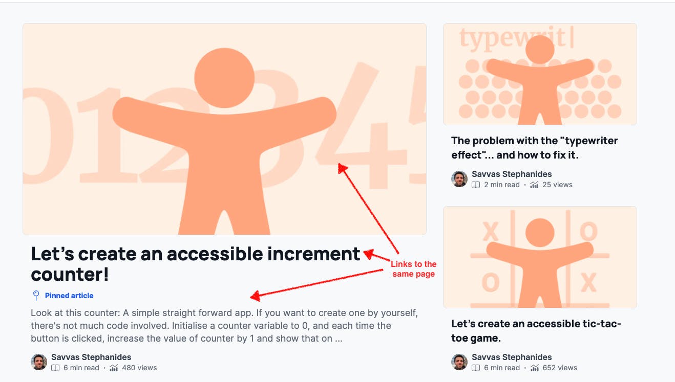
Although not a serious violation, redundant adjacent links affect the user experience of users relying on keyboard usage and screen readers, as we'll see in the next section.
3. Screen reader issues
As mentioned above, having 3 adjacent links that lead to the same page, can affect the user experience of keyboard users, but it can also affect screen reader users.
It gets slightly more confusing for screen reader users when you consider what the screen reader announces back to the user:
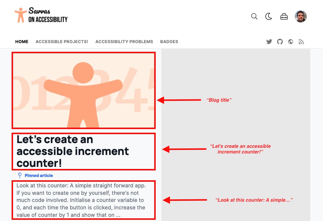
"Blog title": When the screen reader has the focus on the thumbnail, that's what it literally announces: "Blog title". Not a very clear indicator of what the user should expect when clicking the link. A quick inspection shows that this is because of an
aria-labelplaced in theatag."Let's create an accessible increment counter": When the screen reader has the focus on the post title, it announces just that. In this case, the user has a more clear indicator of what they're about to read once they click on the link.
"Look at this counter: A simple straight forward app. If you want to create one by yourself...". In this case, the whole paragraph visible under the title is read back to the user as the title of the link. For more reasons than one, this is not a very good title for a link if you ask me.
To avoid these issues, all we need to do is to enclose all elements that we need to be links into a single <a> tag. Yes, we can do that:
<a href="/my-post">
    <img alt="" src="thumbnail.png"/>
    <h2>Let's create an accessible increment counter!</h2>
</a>
<div>Look at this counter: A simple straight forward app</div>
Conclusion
Although it might seem this way, this is by no means a way to point a finger and call out Hashnode in any shape or form. As a matter of fact, I love Hashnode so much that I'm currently in the process of migrating all my accessibility related posts from elsewhere into Hashnode. These were merely observations that I noticed on my brief period of working on my blog with Hashnode.
❤️ you Hashnode!
Thank you for reading.

