

Let's create an accessible animated counter! 🔢 ♿️

Do you have a ton of subscribers on YouTube? A six-figure follower count on Twitter? Earned a ton of money on your SaaS? Whenever you have an achievement you're proud of, the best way to present it on your website is with a nice animated counter that counts from 0 up to whatever number you want to drive the point home.
Whatever you think of animated counters (great feature? unnecessary eye candy?) they're here to stay. They provide an extra layer of interaction that can attract the users' eyeballs.
Now here's the thing: as with all excessive animations, they can be an accessibility nightmare. From dynamically changing HTML elements to excessive animations, these are issues that can hurt your website's accessibility.
1. What we're creating
In this tutorial, we're going to build an animated counter from scratch. The counter will contain a counter element and a label element for our counter (eg. "followers"). The counter will be counting up from 0 towards a specified number. After creating the basic app, we're going to update the app with some necessary enhancements to make our counter more accessible.
Let's go!
2. The basic app code
Adding the page elements with HTML
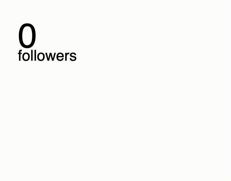
Let's first create the HTML elements. Initially, we only need two elements: the number counter, which is initially set to 0, and a label, for example, "followers".
Let's also wrap the whole thing in a "container":
<div class="counter-container">
  <div class="number">0</div>
  <div class="label">followers</div>
</div>
This is what our counter looks like with just HTML:
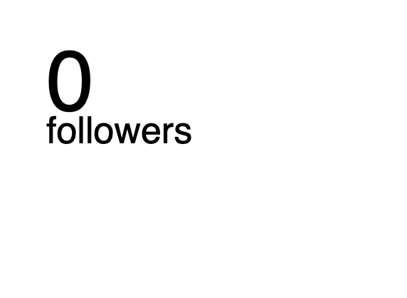
Making the elements look good with CSS
Next, let's style our elements:
Give our text a sans-serif font
Give the counter a large font size
Give the label a large font size but smaller than the counter:
*{
  font-family: sans-serif;
}

.counter-container{
  margin: 60px;
}

.counter-container .number{
  font-size: 120px;
}

.counter-container .label{
  font-size: 52px;
  margin-top: -30px;
}
After updating our CSS, this is what our counter looks like:
Animate our counter with Javascript
Finally, let's create the animated counter effect itself, using Javascript.
First, let's store the settings for our counter in a config object:
const config = {
  amount: 4_582,
  increment: 50,
  counterSpeed: 10
}
Now let's use the DOM to get the counter element:
let counter = document.querySelector(".counter-container .number")
Finally, let's use setInterval() to animate our counter from 0 to the amount we specified:
let i = 0
setInterval(() => {
  if (i < config.amount){
    i+=config.increment
    counter.innerText = i
  }
  else{
    counter.innerText = config.amount
  }

}, config.counterSpeed)
This is what it looks like after we update our Javascript:
3. Accessibility enhancements
As with any widget of this kind, it comes with some accessibility concerns. Things such as screen readers not being able to pick up the correct number to the effect being annoying at best and triggering at worst. In this section, we're going to enhance our animated counter to be more accessible, starting with the basics (contrast) and moving to more advanced settings like screen reader compatibility and reducing motion.
♿️ Contrast
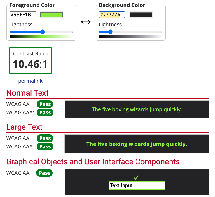
Let's add some text and background colour to our counter. A light colour for the text and a dark background colour.
For the text colour, I've selected a green colour (
#9BEF1B)For the background, a dark grey colour (
#27272A)
I've found this colour scheme on ColourHub which I think works well.
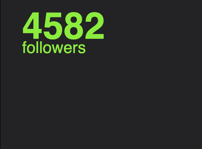
We can also see that these colours also have good contrast.
Here's what we have so far:
Video description
An animated counter which goes from 0 to 4582. A "followers" label appears under the counter
♿️ Screen reader compatibility
A major accessibility problem is when a screen reader tries to read the counter back to the user. When a screen reader reads a website, it does so element by element, depending on which element has the focus.
This means that when the counter has the focus, the screen reader will attempt to read the number that is present at that time. For example, if you need your counter to go up to 5000, and the counter effect is still at 3100, the screen reader will read "3100" back to the user. Not what we want.
To fix this issue, here's what we need to do:
Hide the
numberelement so that the screen reader doesn't bother reading them.Create a new element which contains the full text (i.e. "4582 followers") which is only going to be visible to screen readers (visually hidden).
To hide elements from screen readers, we're going to use an attribute called aria-hidden and set it to true:
    <div class="counter-container">
        <div class="number" id="counter-number" aria-hidden="true">0</div>
        <div class="label" id="label-number">followers</div>
    </div>
The number element is now invisible from screen readers so they won't bother reading it back to users.
The next step is to create a new element which is going to be invisible to sighted users, but visible to screen readers. To create this, we're going to create a visually hidden element. First, create a div and enter the amount for your counter:
<div class="counter-container">
+    <div>4582</div>
    <div class="number" id="counter-number" aria-hidden="true">0</div>
    <div class="label" id="label-number">followers</div>
</div>
Next, we're going to update our CSS to include a class which hides an element visually, called visually-hidden:
  .visually-hidden {
    clip: rect(0 0 0 0);
    clip-path: inset(50%);
    height: 1px;
    overflow: hidden;
    position: absolute;
    white-space: nowrap;
    width: 1px;
  }
Learn more about visually hidden elements
Now, we can add the .visually-hidden class in our new div element:
<div class="counter-container">
-    <div>4582 followers</div>
+    <div class="visually-hidden">4582</div>
    <div class="number" id="counter-number" aria-hidden="true">0</div>
    <div class="label" id="label-number">followers</div>
</div>
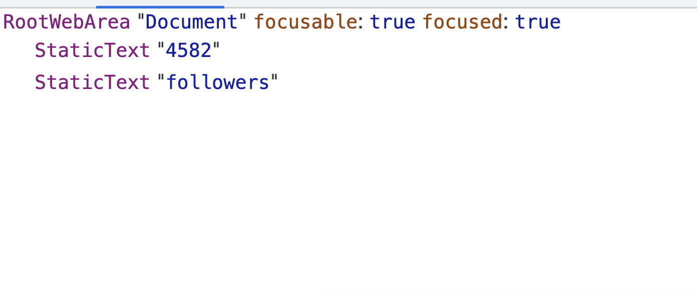
If we now check the accessibility tree in our browser, we can see that the full correct text is read by screen readers.
♿️ Turn off animation
Although animated counters are fun to look at, they come with one more accessibility problem: excessive animations can be triggering for users with vestibular disorders. Also, they can be just plain annoying.
There's an option in most operating systems (desktop and mobile) to turn off animations, called "reduce motion".
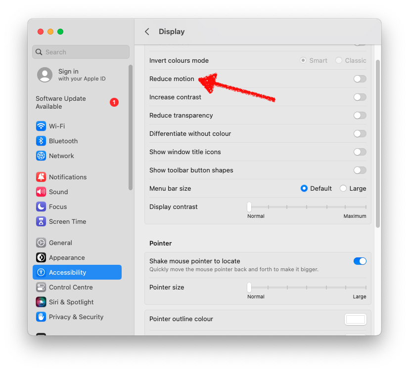
It is up to the developer to detect whenever a user has this option turned on or off and turn off the animation whenever they have the "reduce motion" option turned on.
Thankfully, CSS has this handy @media query called prefers-reduced-motion. The way this query works is this:
@media (prefers-reduced-motion: no-preference) {
    button {
        animation: vibrate 0.3s linear infinite both;
    }
}
In this example, the button element is animated only if the user has their "reduce motion" setting to "Off", or in CSS terms: prefers-reduced-motion: no-preference .
In our example we're going to:
Make our
visually-hiddenelement visible by default, since it's not animated, and set the animated counter as invisible.If the user has no preference for reduced motion, make the
visually-hiddenelement invisible and set the animated element to visible.
💡 A good practice is to have animation opt-in instead of opt-out, in case an operating system or browser doesn't support "reduced motion".
Here's how to do it:
Update the HTML to include two new classes: non-animated for the non-animated counter and animated for our animated counter:
<div class="counter-container">
    <div class="number non-animated visually-hidden">4582</div>
    <div class="number animated" id="counter-number" aria-hidden="true">0</div>
    <div class="label" id="label-number">followers</div>
</div>
In our CSS, we first set our animated element as invisible by default:
.number.animated{
  display: none;
}
Finally, we can use prefers-reduced-motion in our CSS to set visibility of our elements when "reduced motion" is set to "Off":
Set the
animatedelement as visibleMove the
visually-hiddendeclaration in theprefers-reduced-motionblock so it's only hidden when "reduced motion" is set to "off":
@media (prefers-reduced-motion: no-preference) {

  .visually-hidden{
    clip: rect(0 0 0 0);
    clip-path: inset(50%);
    height: 1px;
    overflow: hidden;
    position: absolute;
    white-space: nowrap;
    width: 1px;
  }

  .number.animated {
    display: block;
  }
}
As a last step, we can update the DOM counter declaration to include the .animated class, so that only the animated counter element gets animated:
let counter = document.querySelector(".counter-container .number.animated")
So after we update our HTML and CSS, our counter should work like this:
Video description
A split screen with the counter on the left and Display settings on the right. "Reduce motion" setting is set to "On". The browser is refreshed and the counter is not animated. The "Reduce motion" setting is then set to "Off" and the browser is refreshed again, showing an animated counter
4. Conclusion
In this tutorial, we took a popular element, an animated counter, and made it accessible. We added some colour to our counter with good contrast, then we made it compatible with screen readers and finally, we used a lesser known accessibility feature where we cater for users who prefer less motion.
Have you tried this tutorial out? Let me know how you found it! 🔥
Thank you for reading! 👋👋👋


