

Let’s create an accessible link page!

Introduction
Do you have a Linktree account? Or any other site that lets you list a bunch of links that you can point to from your Twitter or Instagram profile? Maybe you tried your hand at creating your own link page! It's not so difficult right? Just a profile picture at the top, some links and voila! It's all done! This article will take things a bit further. Make your link page, fully accessible! Let's go!
The project
To start off the tutorial, we are going to create a very simple link page.
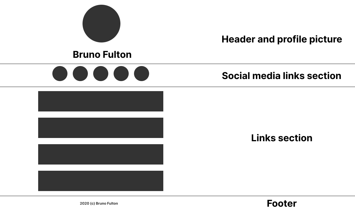
This is what the page will include:
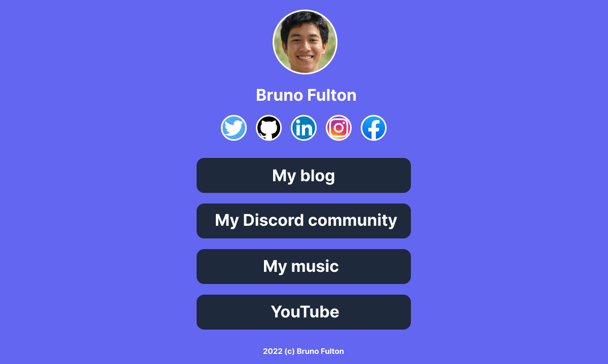
- A header: This will just include a profile picture and your name
- Social media icons: This is a row of icons that point to other social media pages, like Twitter or LinkedIn
- A links section: This is going to be the section will all our links.
- A footer: The bottom of the page which will just include a copyright notice.
Let's go:
The header
The header section will contain two elements: a profile picture and the name of the profile. To create this element we are going to use semantic HTML:
♿️ Accessibility enhancement: Enclose the header section with a <header> tag. This helps with SEO and also for screen readers to announce the section as a header.
So here's how our header looks like in HTML:
<header>
    <div id="profile-picture">
        <img src="pfp.png">
    </div>
    <div id="page-name">
        <h1>Bruno Fulton</h1>
    </div>
</header>
And the CSS:
header #profile-picture{
    display: flex;
    height: 180px;
}

header #profile-picture img{
    margin: auto;
}

header #page-name{
    display: flex;
    height: 30px;
}

header #page-name h1{
    margin: auto;
    color: white;
}
Since the profile picture doesn't give us any useful information about the page, it makes sense that a screen reader skips it:
♿️ Accessibility enhancement: Give the profile picture a blank alt text: alt="". The screen reader will see the image as decorative and therefore skip it. This will improve the user experience of screen reader users.
<header>
    <div id="profile-picture">
-        <img src="pfp.png">
+       <img src="pfp.png" alt="">
    </div>
    <div id="page-name">
        <h1>Bruno Fulton</h1>
    </div>
</header>
A simple name in the h1 tag, doesn't quite convey the purpose of this page. An alternative title such as "Bruno Fulton's links" would be clearer. So let's enhance our title:
♿️ Accessibility enhancement: Use a visually-hidden element for an alternative title which is only accessed by screen reader users. Use aria-hidden to hide the original title from screen readers.
<header>
    <div id="profile-picture">
        <img src="pfp.png" alt="">
    </div>
    <div id="page-name">

-        <h1>Bruno Fulton</h1>
+        <h1 aria-hidden="true">Bruno Fulton</h1>

+        <h1 class="visually-hidden">Bruno Fulton's links</h1>
    </div>
</header>
This is the CSS for the visually-hidden element:
.visually-hidden:not(:focus):not(:active) {
  clip: rect(0 0 0 0);
  clip-path: inset(50%);
  height: 1px;
  overflow: hidden;
  position: absolute;
  white-space: nowrap;
  width: 1px;
}
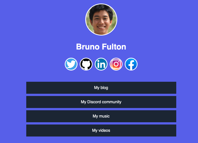
The end result of our header:

The social media section
Now let's move on to our social media links. Since we're moving away from the header, let's add another important tag:
♿️ Accessibility enhancement: Add a <main> tag which will enclose our social media icons and links later on.
<main>
            <!-- Social media and links go here -->
</main>
To enclose our social media icons, we'll once again use semantic HTML.
♿️ Accessibility enhancement: Use <section> to help screen readers announce the links section as such.
<section id="socials">

</section>
Now, we need to somehow label our section. The best way is to include an h2 heading. But we don't want to it to be visible, only accessible for screen readers:
♿️ Accessibility enhancement: Use <h2> with visually-hidden to include a label for our section without affecting our design:
<section id="socials">
+    <h2 class="visually-hidden">Social media links</h2>
</section>
Now let's include our list of social media icons:
<section id="socials">
    <h2 class="visually-hidden">Social media links</h2>
+    <ul>
+       <li><a href="#"><img src="soc-twitter.png" alt=""></a></li>
+        <li><a href="#"><img src="soc-github.png" alt=""></a></li>
+        <li><a href="#"><img src="soc-linkedin.png" alt=""></a></li>
+        <li><a href="#"><img src="soc-instagram.png" alt=""></a></li>
+        <li><a href="#"><img src="soc-facebook.png" alt=""></a></li>
+    </ul>
</section>
And some styling:
section#socials{
    height: 120px;
    display: flex;
}

section#socials ul{
    display: flex;
    list-style: none;
    gap: 9px;
    margin: auto;
}
Now, although each link has an image, it doesn't have some text in order to announce it to the screen reader users correctly. Let's fix this:
♿️ Accessibility enhancement: Use aria-label to add some text to each link so that screen reader users know where they're going.
-<li><a href="#"><img src="soc-twitter.png" alt=""></a></li>
+<li><a href="#" aria-label="Go to my Twitter profile"><img src="soc-twitter.png" alt=""></a></li>
-<li><a href="#"><img src="soc-github.png" alt=""></a></li>
+<li><a href="#" aria-label="Go to my Github profile"><img src="soc-github.png" alt=""></a></li>
-<li><a href="#"><img src="soc-linkedin.png" alt=""></a></li>
+<li><a href="#" aria-label="Go to my LinkedIn profile"><img src="soc-linkedin.png" alt=""></a></li>
-<li><a href="#"><img src="soc-instagram.png" alt=""></a></li>
+<li><a href="#" aria-label="Go to my Instagram profile"><img src="soc-instagram.png" alt=""></a></li>
-<li><a href="#"><img src="soc-facebook.png" alt=""></a></li>
+<li><a href="#" aria-label="Go to my Facebook profile"><img src="soc-facebook.png" alt=""></a></li>
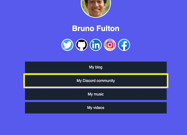
Now that we've made our icons screen reader accessible, let's make them keyboard accessible. Let's make it so it's obvious which icon has the focus when the user taps the Tab key on their keyboard:
♿️ Accessibility enhancement: Use the CSS :focus selector to style each link when it has keyboard focus.
section#socials ul li a:focus{
    outline: 6px solid yellow;
}
This will give each link a yellow outline whenever it has keyboard focus.

The links section
Just like with the social icons section, we need to start with the section tag with a hidden h2.
♿️ Accessibility enhancement: Use section with a visually hidden h2 tag to give it a label:
<section id="links">
    <h2 class="visually-hidden">Links</h2>
</section>
Now let's include our links as an unordered list:
♿️ Accessibility enhancement: Use ul and li so that screen readers announce our links as a list.
<section id="links">
    <h2 class="visually-hidden">Links</h2>

    <ul>
        <li><a href="#">My blog</a></li>
        <li><a href="#">My Discord community</a></li>
        <li><a href="#">My music</a></li>
        <li><a href="#">My videos</a></li>
    </ul>
</section>
Now let's style our links:
section#links ul{
    list-style: none;
}

section#links ul li{
    max-width: 600px;
    margin: auto;
}

section#links ul li a{
    display: block;
    background-color: #1E293B;
    text-align: center;
    color: white;
    text-decoration: none;
    padding: 15px 0;
    margin-top: 9px;
}
Once again, let's make our links keyboard accessible:
♿️ Accessibility enhancement: Set the styling to put a yellow border around each link when the keyboard has focus.
section#links ul li a:focus{
    outline: 6px solid yellow;
}
The footer
Now we're done with the main section, we're only left with the footer section
♿️ Accessibility enhancement: Use the <footer> tag for our footer so that it's announced as such by screen readers and also for SEO.
<footer>
<div>2022 © Bruno Fulton</div>
</footer>
Summary
In this article we got a simple "links page" and made it as accessible as possible. Enhancements included:
- Use of semantic HTML elements such as
header,footerandmain. - Use of the
visually-hiddenelement which hides stuff visually but is accessible by screen readers - Use of
aria-hiddenwhich hides stuff from screen readers but is is shown visually - Use of
aria-label - Use of empty
alttext.
🔗 Here is the full code for the project we just created
These are simple enhancements but will make your link page a lot more accessible and inclusive.
Have you created your own link page? How did this article help you enhance it? Let me know!


